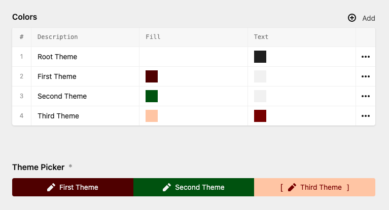
The Kirby ThemePicker plugin allows you, to select a set of stylings which comes from your a blueprint or a struct.

Requirement: Kirby 3.8.2 or above
Get the plugin here and unzip it to your plugin folder: /site/plugins/
If you want to set your colors and other stylings in the blueprint, you can do it like this:
    themepicker1:
        label: Theme Picker Simple
        type: themepicker
        default: theme2
        options:
            theme1:
                label: Theme1
                background: "#ff00ff"
                color: "#000000"
                icon: text
                text-align: "left"
            theme2:
                label: Theme2
                background: "#0000ff"
                color: "#000000"
                icon: text-center
                text-align: "center"
            theme3:
                label: Theme3
                background: "#ffff00"
                color: "#000000"
                icon: text-right
                text-align: "right"
This will give you this panel view:

Now, let us take care of the output:
<?php $picker = $page->themepicker() ?>

    <div class="<?= $picker->getTheme() ?>" style="<?= $picker->getThemeStyle(['background', 'color']) ?>">
        <span class="<?= $picker->getThemeStyle(['text-align']) ?>">My beautyfull text</span>
    </div>
In this example you'il get this output:
<div class="theme2" style="background:#0000ff;color:#000000;">
        <span class="text-align:center;">My beautyfull text</span>
    </div>
Explanation
As you see, you don't just select a theme an get the name of the theme. You can also use options parameter in your output.
getTheme(): Gets the class name. You can pass here a key, to get a specific value. E.g. $picker->getTheme('color'). "*" return all values as an array.
getThemeStyle(): Returns all the styling from the current theme. You can pass an array or a string of your desired styling. E.g. picker->getThemeStyle('color')
And now we go one step further. Let the panel user decide, which colors and stylings, they want to use/set. For this, we need to set up a structure field first:
styling:
      label: My Styling
      type: structure
      fields:
        label:
          label: Description
          type: text
          width: 2/3
        icon:
          label: Icon
          type: text
          width: 1/2
        class:
          label: Class
          type: text
          width: 2/3
        background:
          label: Fill
          type: colors
          width: 1/2
        border-color:
          label: Border
          type: colors
          width: 1/2
If you don't have a color field available, check out these great plugins from Hana+Nils or Tim Ötting.
All these fields are not mandatory. Here is a list of default values:
If you don't like a label or a icon give them false
And now our theme picker field:
themepicker2:
      label: Theme Picker from struct
      type: themepicker
      options:
        root: root
        color: border-color
        query: site.styling.tostructure
And that's it.
Explanation
Some information about the options values:
You can use the getTheme() and getThemeStyle() methods here too. But in struct mode, you can output the css for each theme. Let's make an example. Put following code into the head section of your website:
    <style>
        <?= site()->themepicker2()->getThemeStyling() ?>
    </style>
The output for that we'll be something like this:
<style>
        :root {
            background: #ffffff;
            border-color: #1c1c1c;
        }
        .first {
            background: #470000;
            border-color: #ffe5e5;
        }
        .second {
            background: #004d0d;
            border-color: #c2ffcc;
        }
    </style>
Parameters of getThemeStyling($prefix, $colapseClass, $remove)
getThemeStyling('--xyz-{{class}}-') returns --xyz-first-background:#ffffff;.Have fun. Need Support? Contact me.